FamilySearch
The Help and Learning page at FamilySearch.com includes a Find Help By Topic section. I was tasked with an exercise of selecting one of the topics in this section, then creating a new page to replace it. The goal of the new page was to produce a design that would better engage the user on their family history journey.

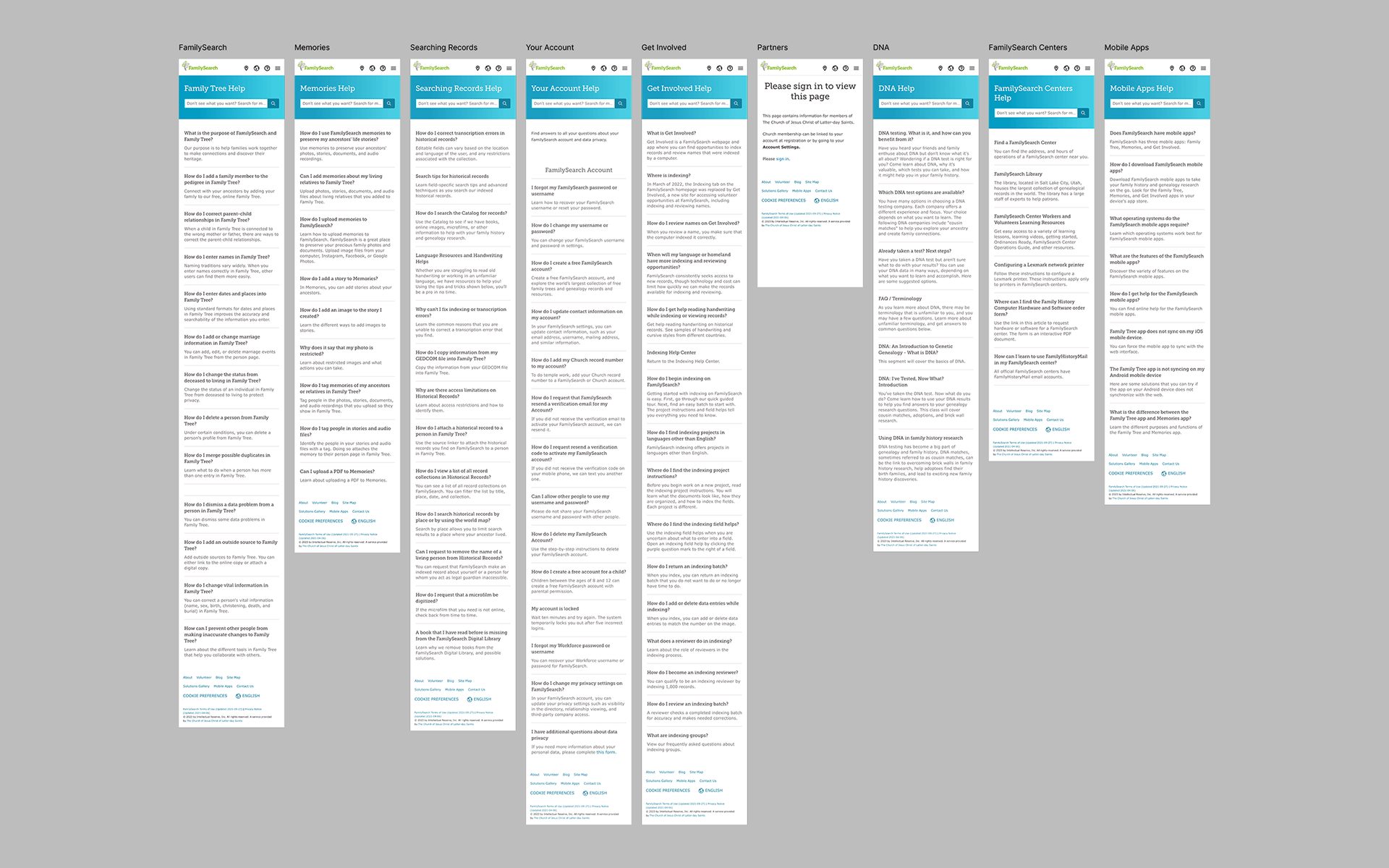
I started by doing an audit of the nine existing “Help By Topic” pages. The pages covered a variety of topics, including the FamilySearch “Memories” feature; information about searching records on the website; how to get involved; etc. I chose to improve the page about the “Memories” feature.

Wireframes
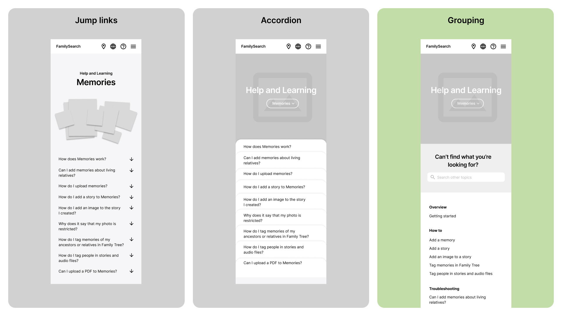
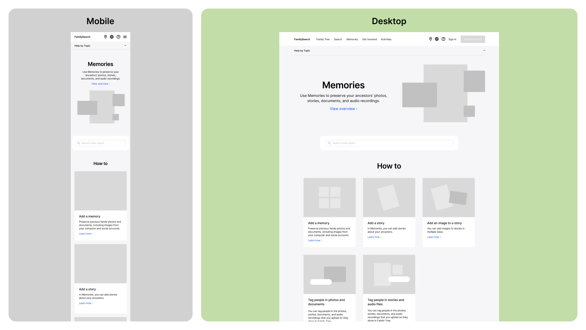
I then explored how best to represent the content in a new way by making wireframes. I initially made the questions jump links, and making them into an accordion. I then explored grouping the information into three buckets. This final approach of grouping seemed to be a good way to simplify the information. But the design was still lacking visual engagement.

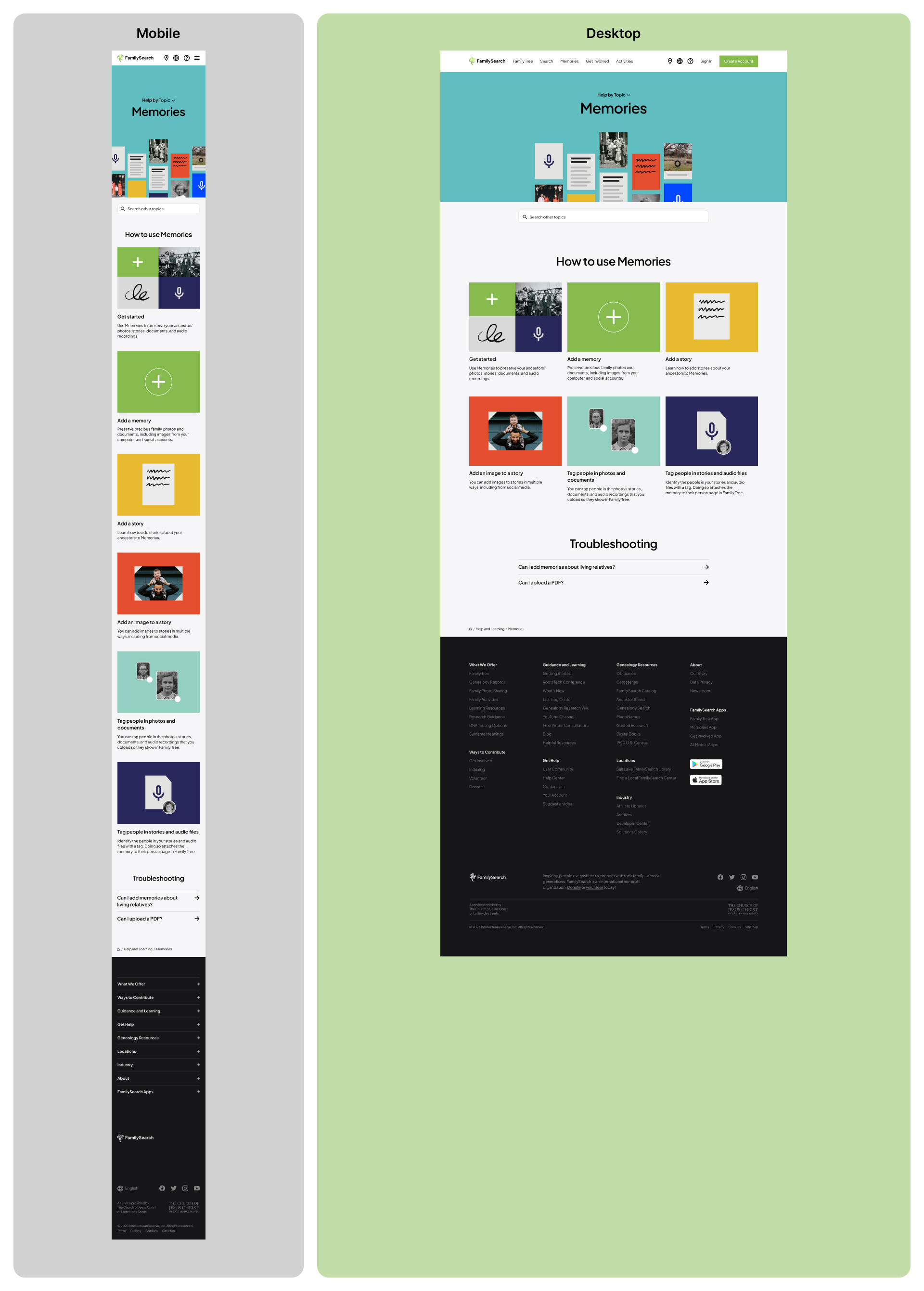
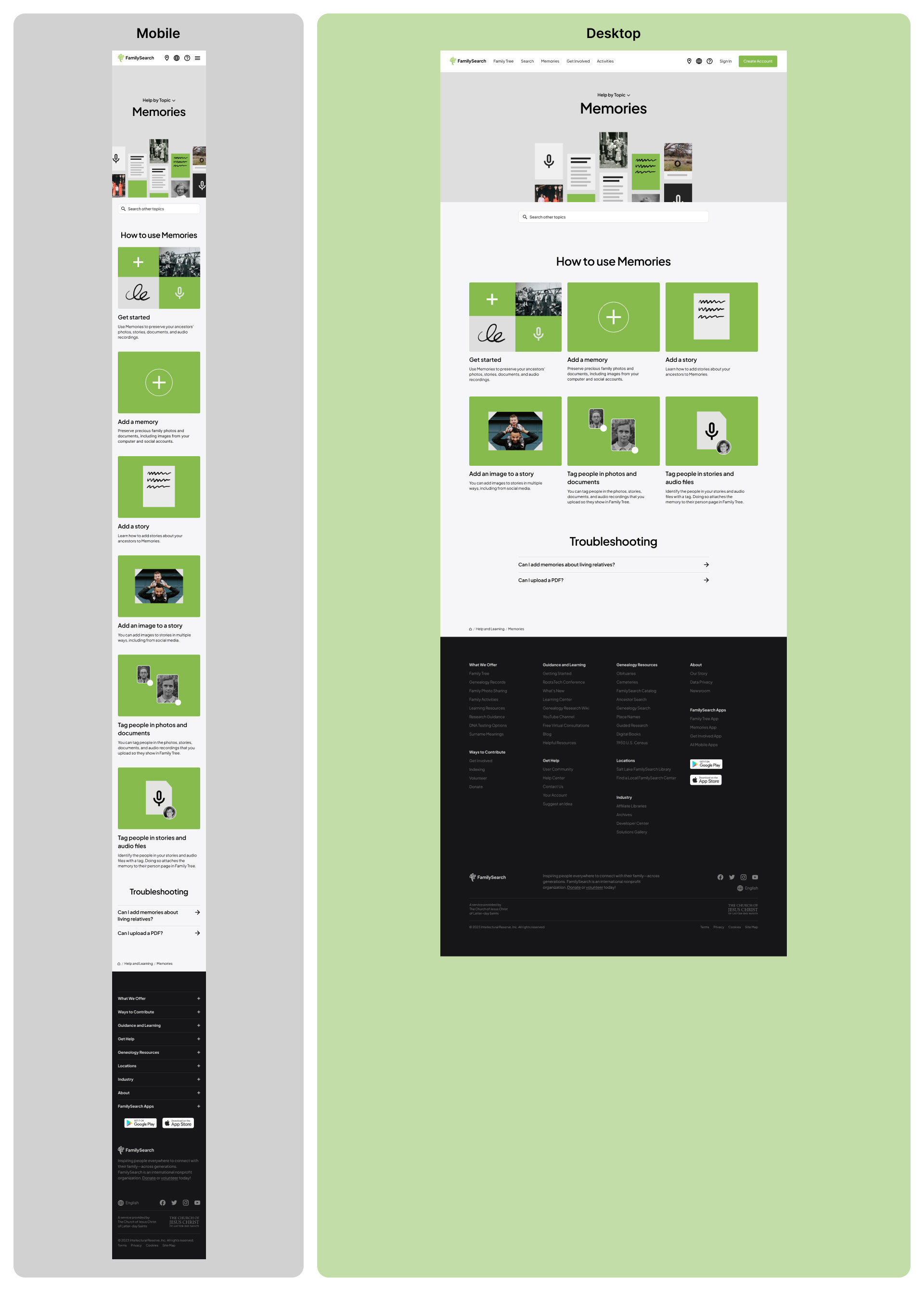
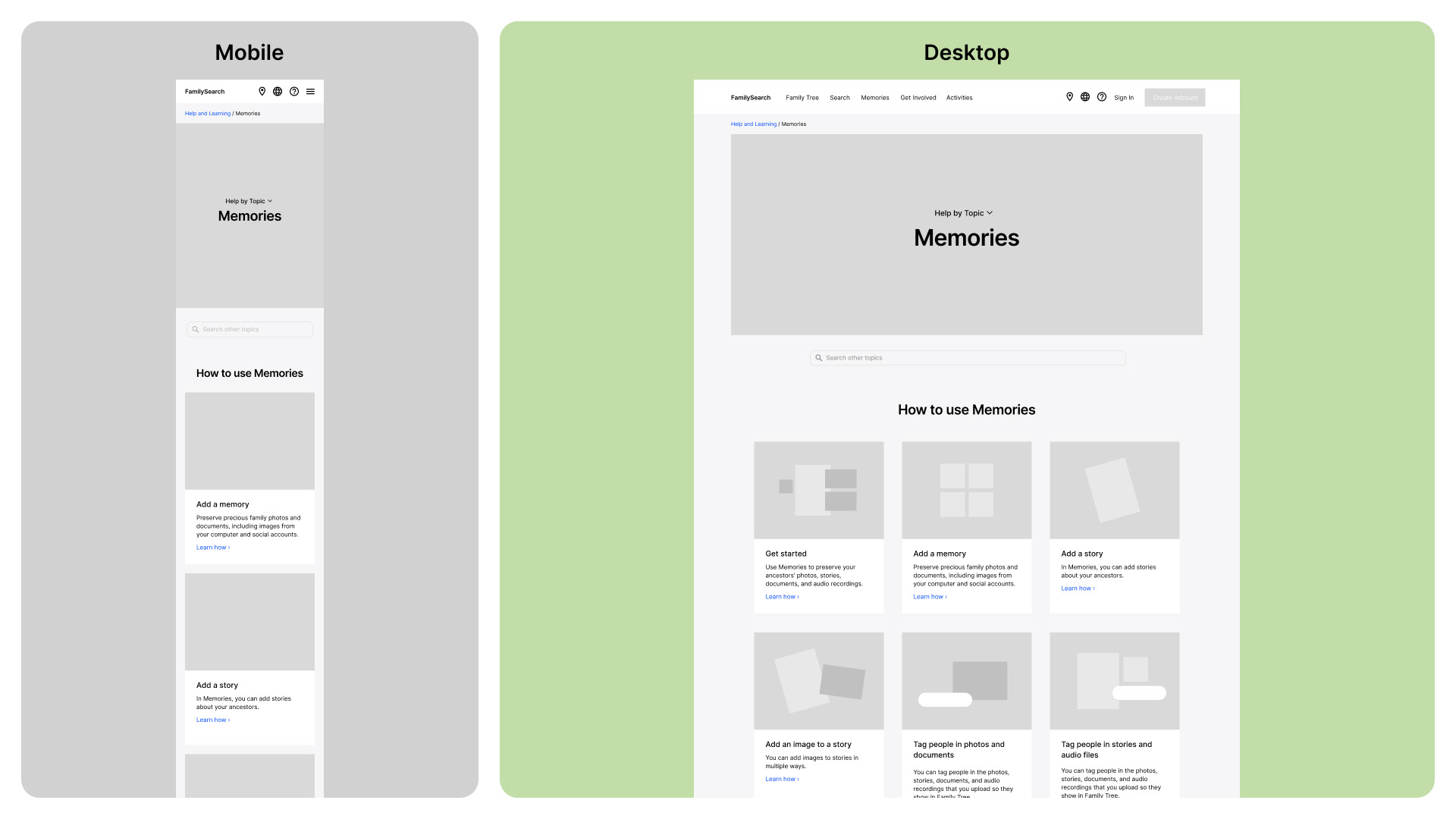
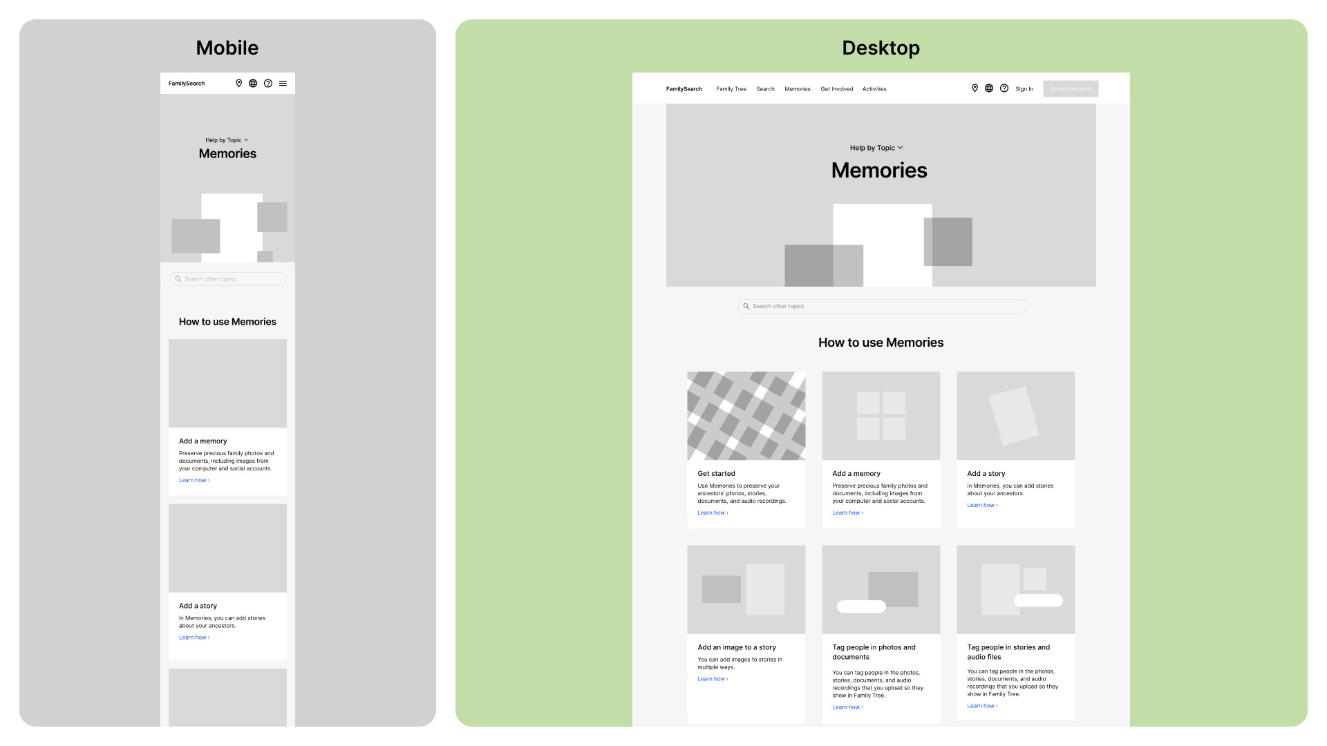
I began adding placeholders for more visuals and exploring what the corresponding desktop view could look like. After several iterations, I landed on a design that was working better to present the information and engage the user.
High fidelity
I did two versions of the high fidelity design: one with a wide color palette, and the other with a more limited color palette. Ultimately my choice was the limited color palette as it felt more refined and sophisticated.