Micro Focus Website
Under the creative direction of David Groom, I was the lead designer in the redesign of the Micro Focus corporate website. The site needed to communicate trust and innovation while helping users quickly find product information, resources, and company updates. Our design approach balanced brand expression with usability, applying several core UX principles to ensure the site was both polished and functional.
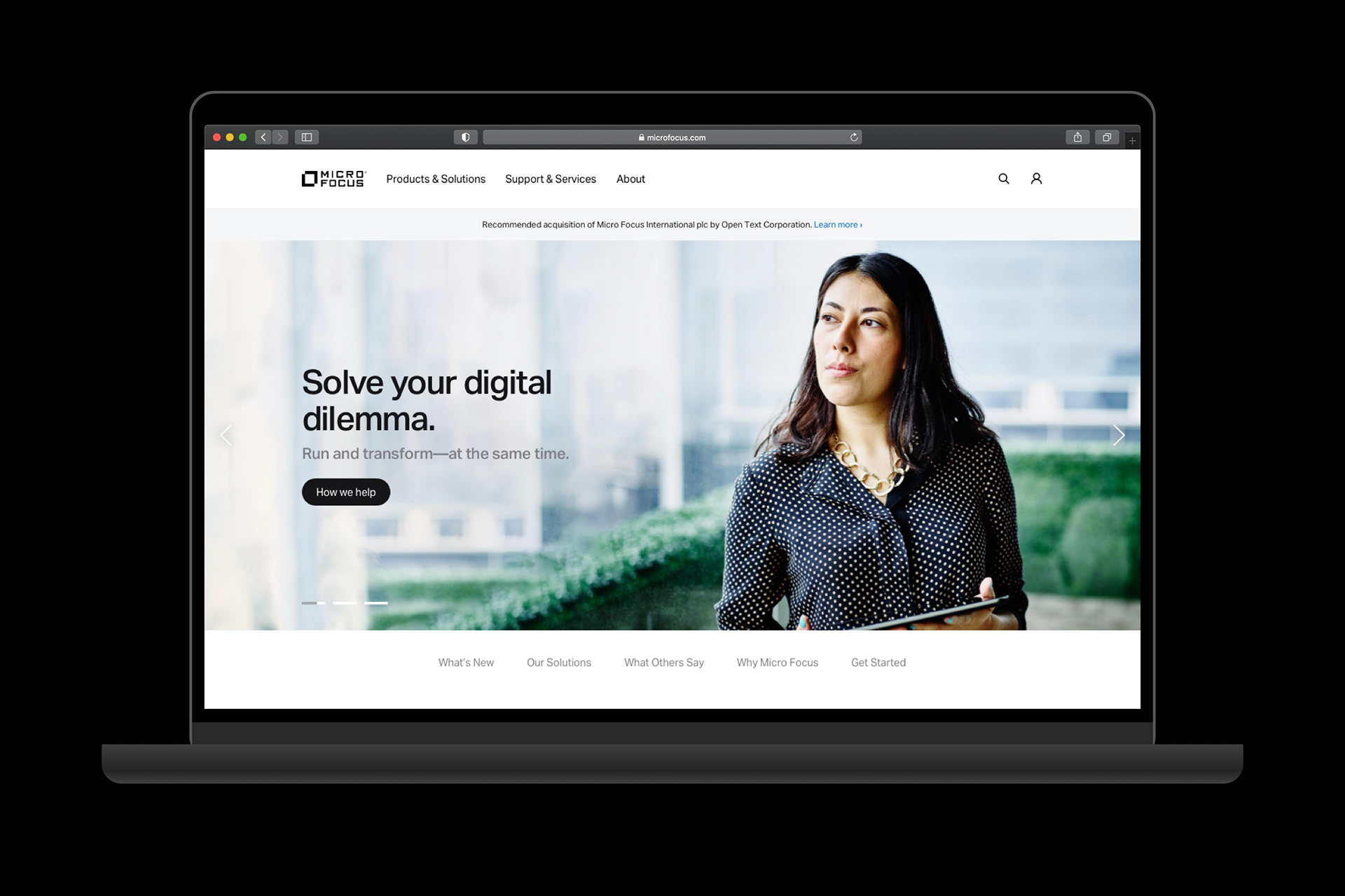
Above: photograph by Thomas Barwick.
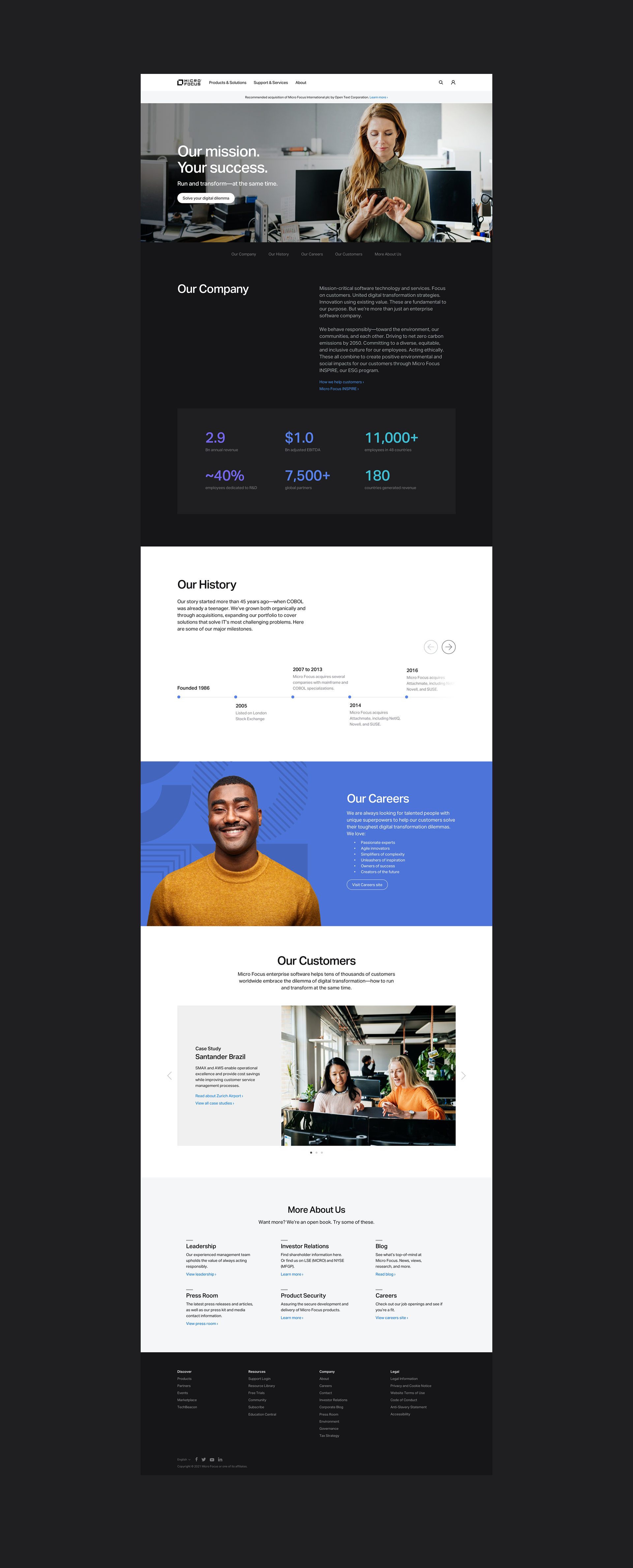
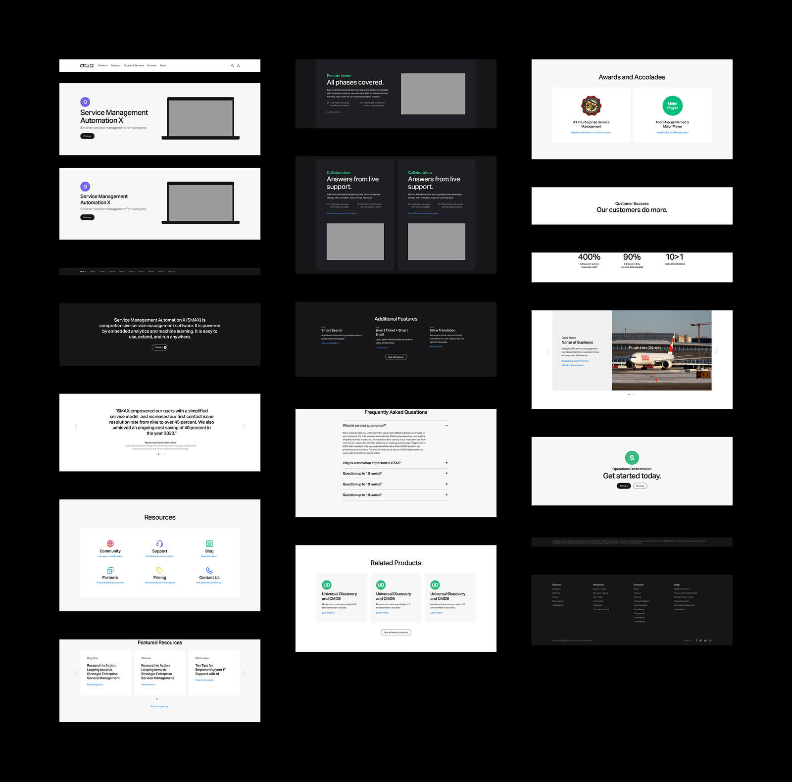
Visual approach. A clean visual style with structured grids, ample whitespace, and consistent typography elevated the brand’s credibility (Aesthetic-Usability Effect). The polished design helped visitors perceive the site as reliable, which is especially critical for a global enterprise software company.
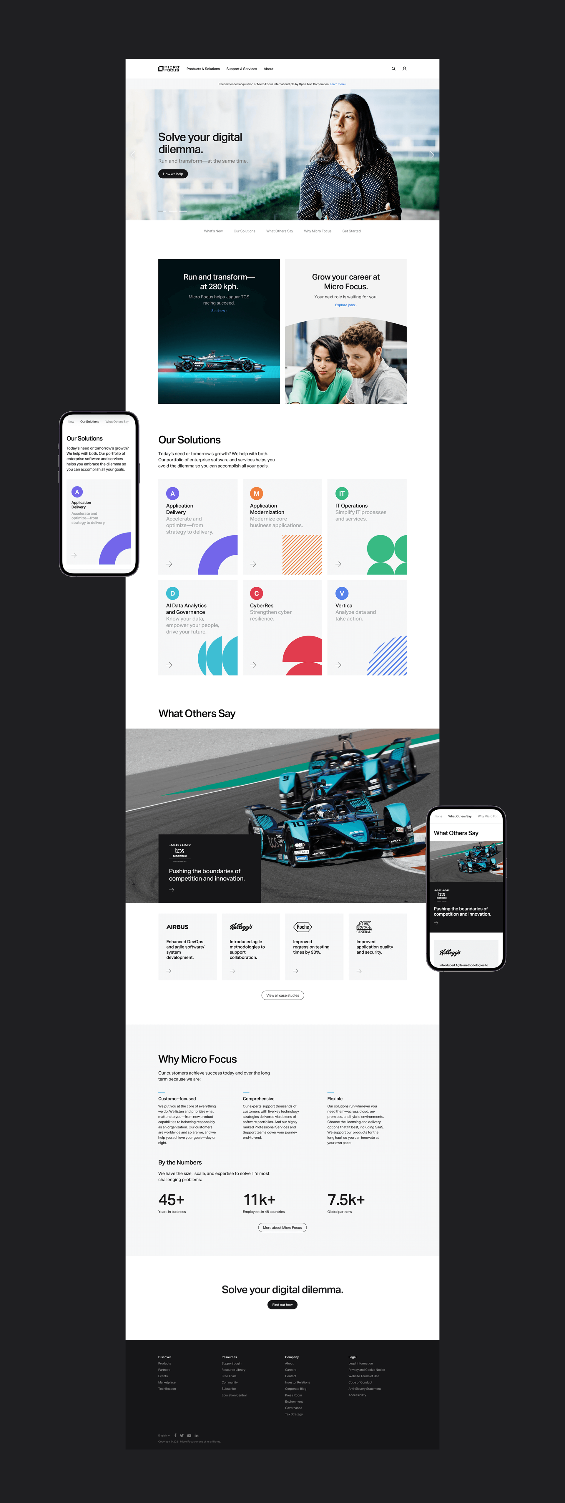
Above: photographs by Thomas Barwick, Jaguar TCS Racing, and Tom Werner.

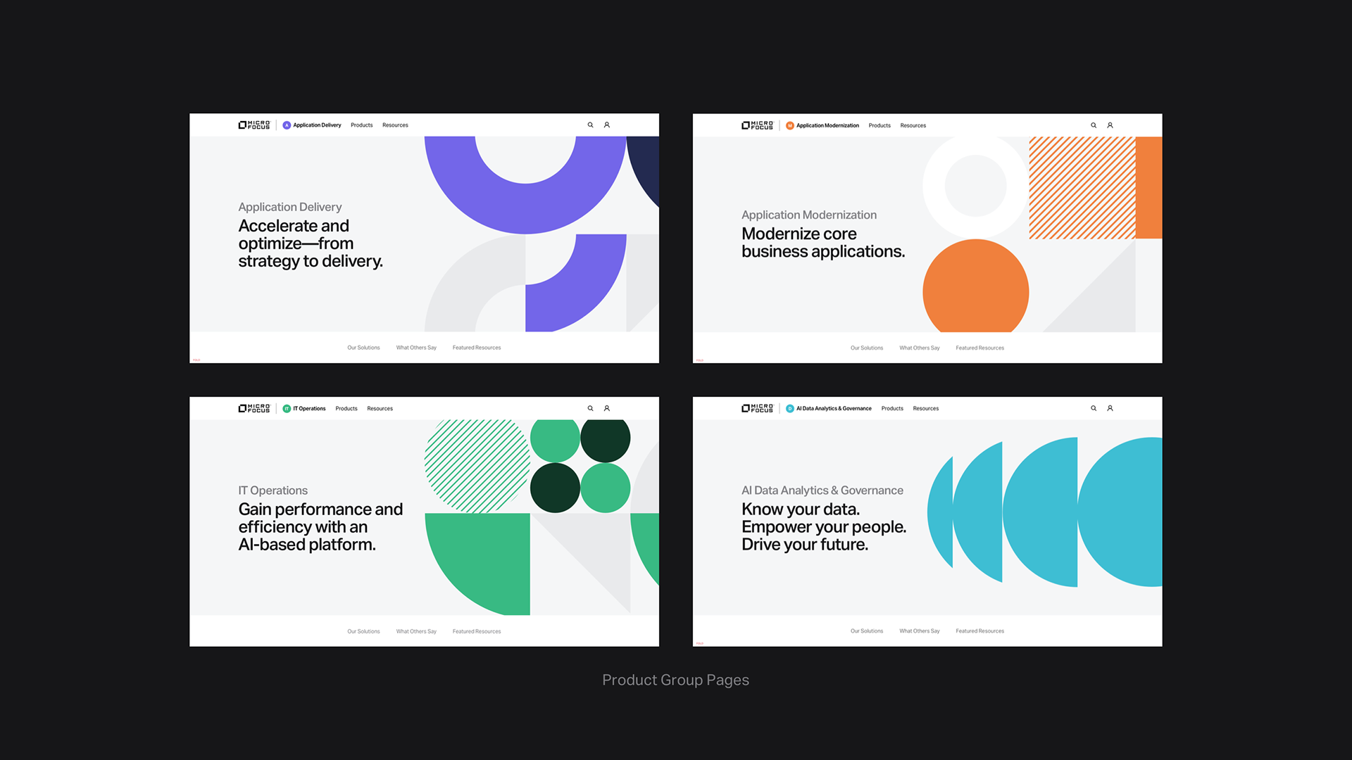
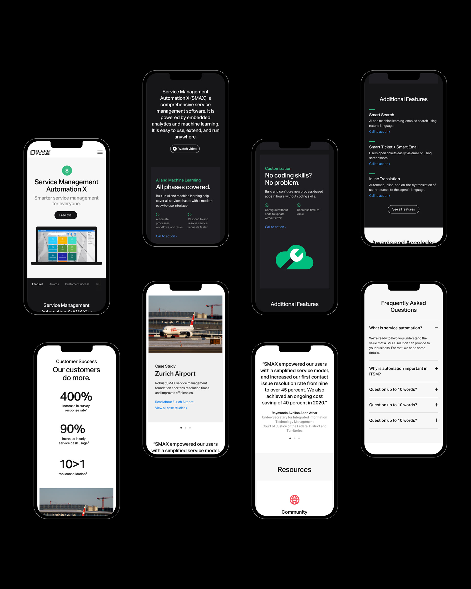
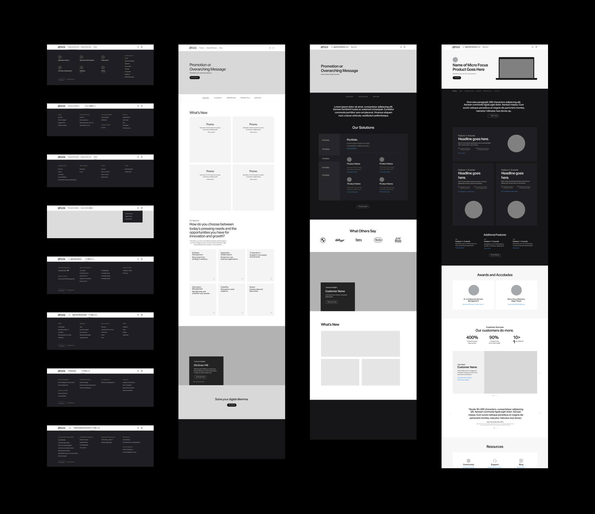
A simplified navigation. Applying Hick’s Law, the navigation was streamlined to highlight only the most important categories (products and solutions, support resources, and company information), reducing cognitive load. Secondary details were tucked into sub-navigation, so users weren’t overwhelmed by choices at the top level.

In addition, each product group had its own page with only two navigation items: products and resources. The more choices users have, the longer it takes them to make a decision. The approach we took helped to greatly simplify the user’s experience.
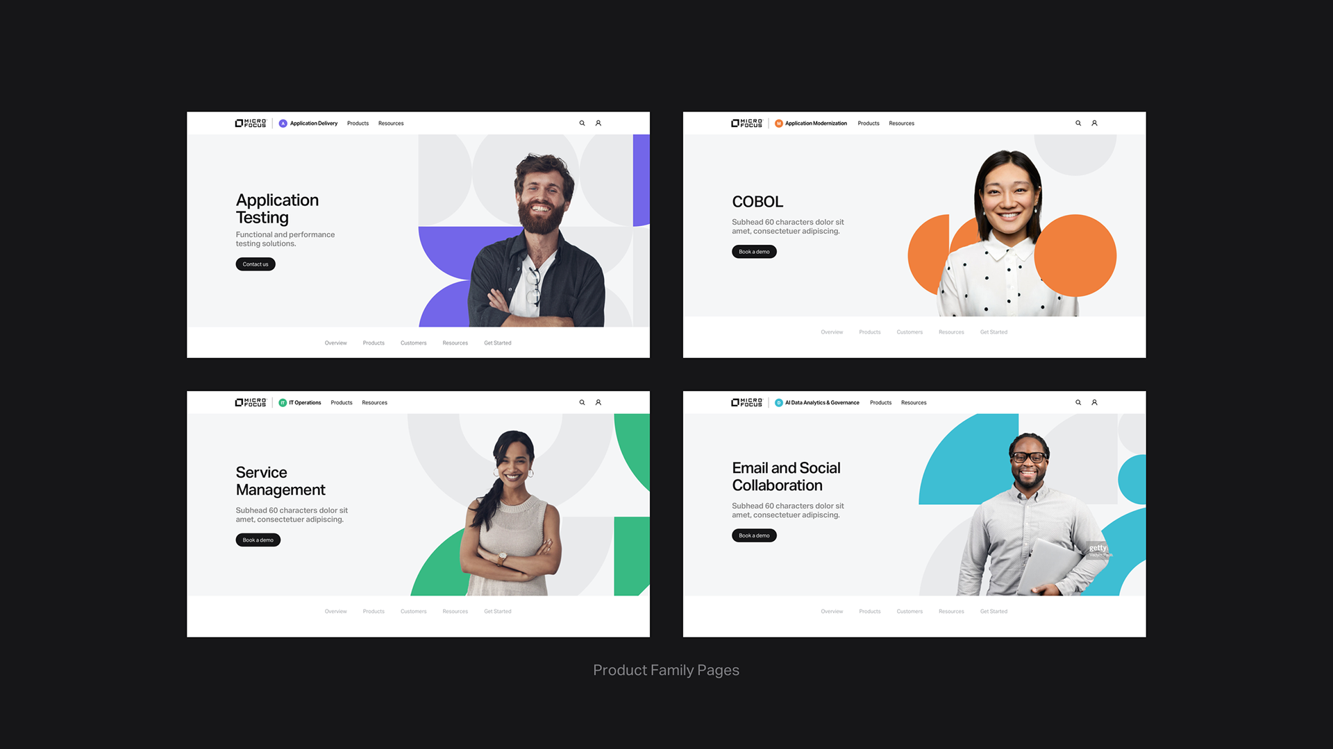
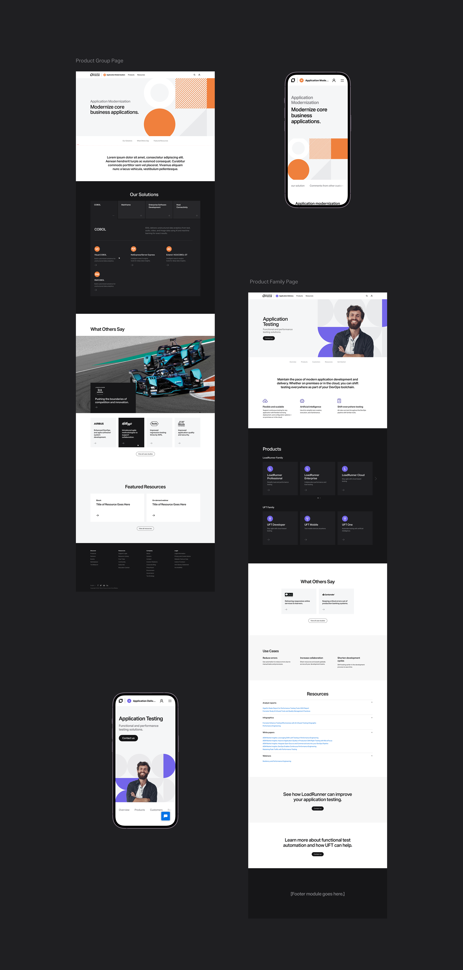
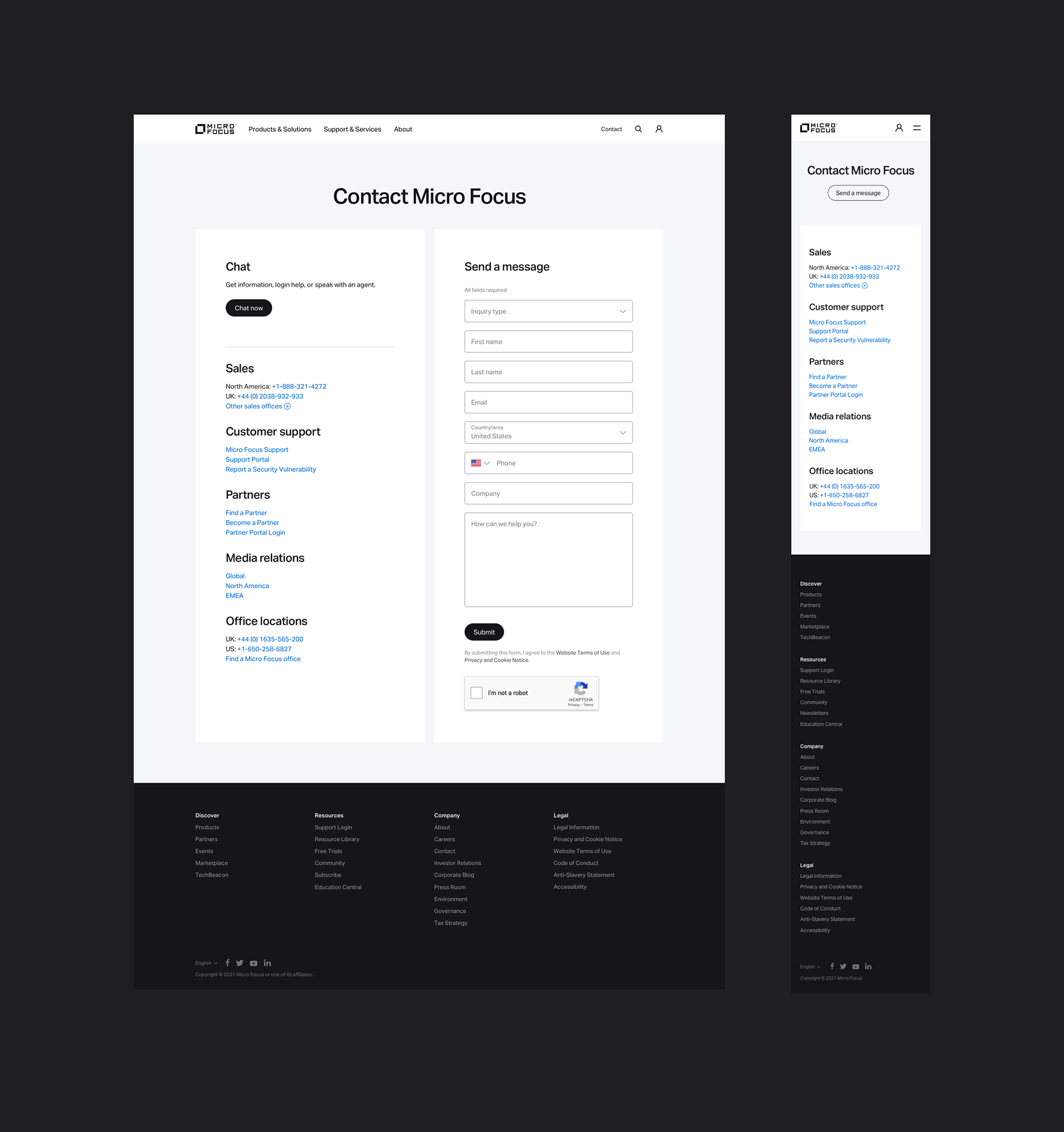
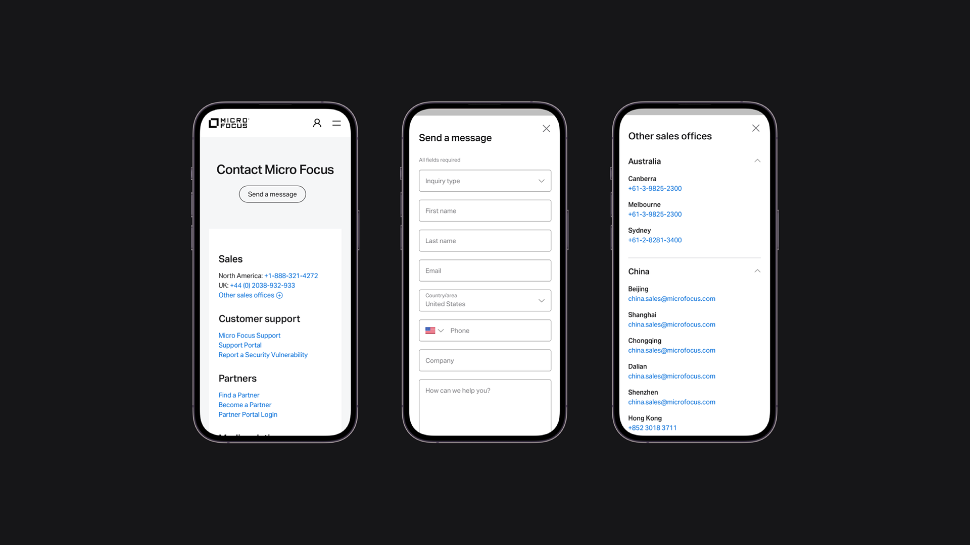
Buttons and key CTAs (like “Chat now” and “Send a message”) were designed with sufficient size, contrast, and placement near likely scanning paths, making them easier to spot and interact with across desktop and mobile devices.
Additional details
Design tools and workflow. For this project, we used Sketch as our primary design tool, starting with wireframes before moving into high-fidelity designs that captured the final look and feel of the site. Sketch’s flexibility allowed us to iterate quickly and maintain a consistent design system across multiple pages. To bridge the gap between design and development, we used Zeplin for handoff—providing developers with precise specifications, assets, and style guides directly from our Sketch files. This workflow minimized miscommunication, helped ensure pixel-perfect implementation, and allowed the team to work efficiently within our agile process.

Wireframes. We kicked things off with low-fidelity wireframes to map out the structure of the site before diving into visuals. The wireframes gave us a way to quickly test layout ideas and focus on user flow. Because they stripped away color and imagery, everyone could zero in on the essentials—navigation, hierarchy, and key interactions—without getting distracted by design details too soon. This upfront work made the later design phase smoother and more intentional.
UI style guide. As part of the project, I created a comprehensive UI style guide to establish a clear visual language for the website. The guide documented core elements such as typography, color palette, iconography, grid systems, and spacing rules, as well as component states for buttons. By defining these standards upfront, we ensured consistency across all pages and made it easier for both designers and developers to align on a shared vision.
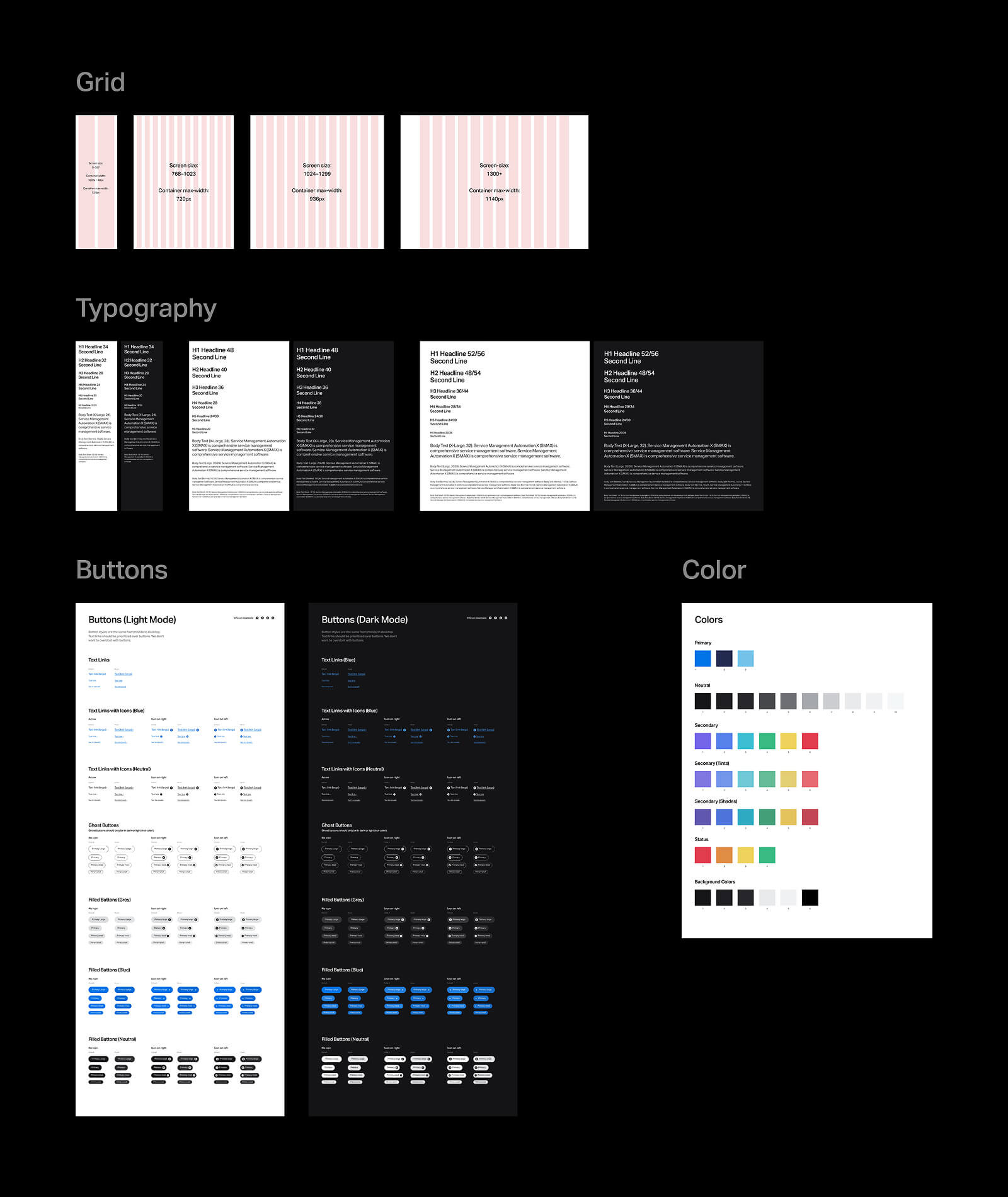
Reusable component library. To streamline development, I designed a library of reusable components that served as the building blocks for pages. These included standardized navigation elements, content cards, and call-to-action modules. Each component was designed to be flexible enough to handle a range of content while maintaining brand consistency. By working with the development team to create this modular system, we reduced duplication of effort, sped up page creation, and established a scalable framework that could easily support future site updates and expansions.
Collaboration in an agile environment. As we moved from design into development, I worked closely with the development team to ensure the designs translated seamlessly into a functional website. In an agile setting, this meant participating in sprint planning, reviewing in-progress builds, and providing quick feedback to resolve design or usability issues as they arose. I documented design specifications, shared reusable components, and clarified interaction details so the developers could work efficiently. This close partnership not only helped keep the project on schedule but also preserved the integrity of the design vision, resulting in a polished site that aligned with both user needs and technical requirements.