Micro Focus
Brand Central Website
Brand Central Website

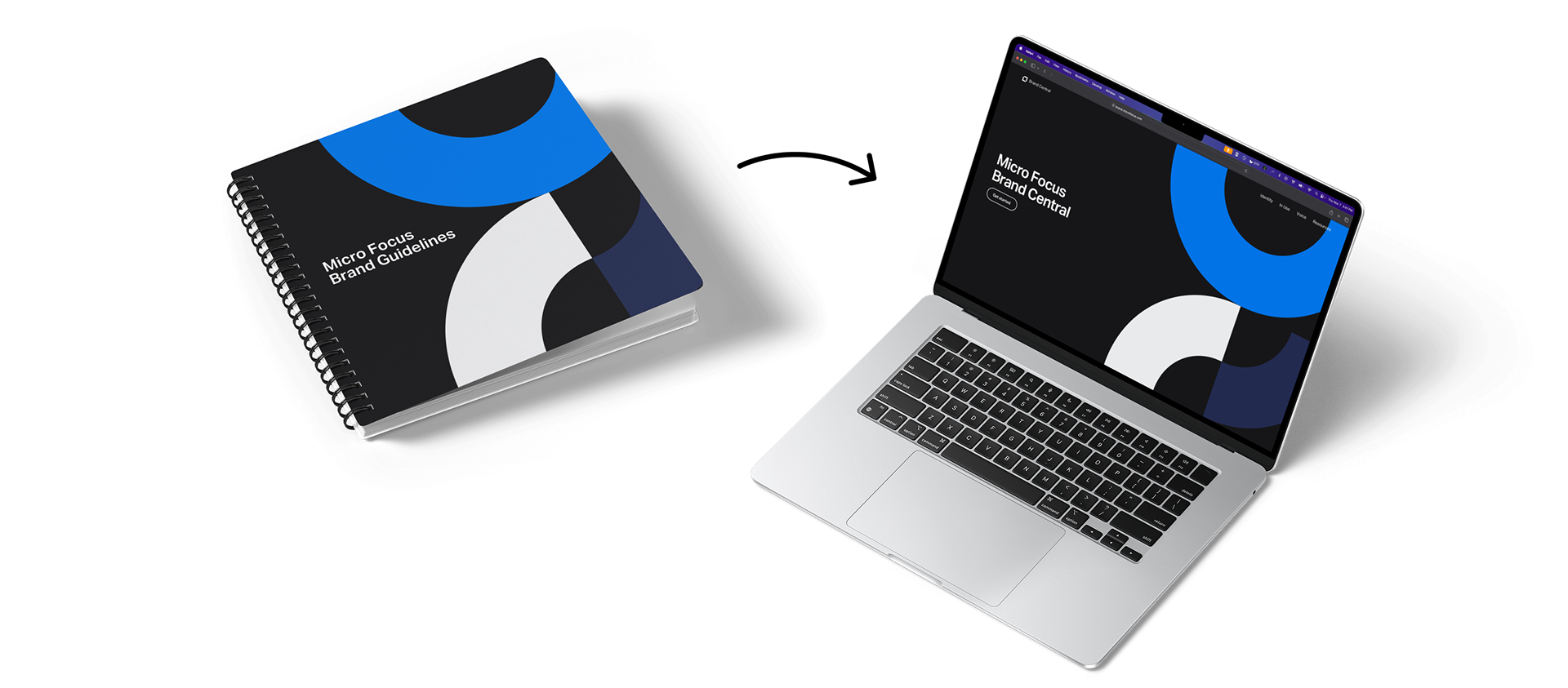
As part of the Brand & UX Team at Micro Focus, I played a lead role in developing a refreshed brand identity for the company. This included designing an updated version of the logo while retaining the classic icon; refreshing the color palette; and introducing a visual language based on geometric shapes to add both interest and color to what can be somewhat drab subject matter. I then designed and built a website as a tool of reference to communicate the guidelines surrounding the new brand.

Website vs. PDF, and
Jakob’s Law
Jakob’s Law
Many employees are familiar with static PDF documents for brand identity guidelines. I wanted to build a website to present our brand identity guidelines so that it could be easily updated. The website would serve as a central source of truth for all the employees of the company to refer to whenever they had questions about how we should look or what we should sound like. Whenever we would make updates to the guidelines, they would be instantly available. A static PDF could not achieve that, but a website would be the perfect tool. So I set out to build a digital take on classic brand guidelines.
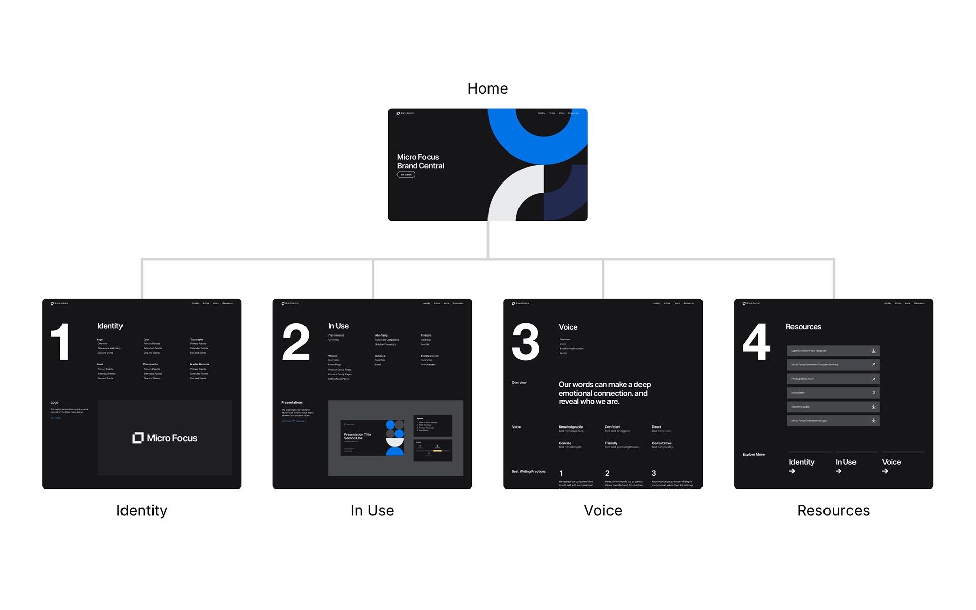
I structured Brand Central to reflect the familiar flow of traditional brand guideline PDFs. People are generally familiar with navigating guidelines in a sequence—from basic identity elements, to in situ examples, to places to get resources. By aligning the site’s structure with this existing mental model, we minimized the learning curve and built instant familiarity, allowing users to confidently find the assets they needed without retraining.
I structured Brand Central to reflect the familiar flow of traditional brand guideline PDFs. People are generally familiar with navigating guidelines in a sequence—from basic identity elements, to in situ examples, to places to get resources. By aligning the site’s structure with this existing mental model, we minimized the learning curve and built instant familiarity, allowing users to confidently find the assets they needed without retraining.

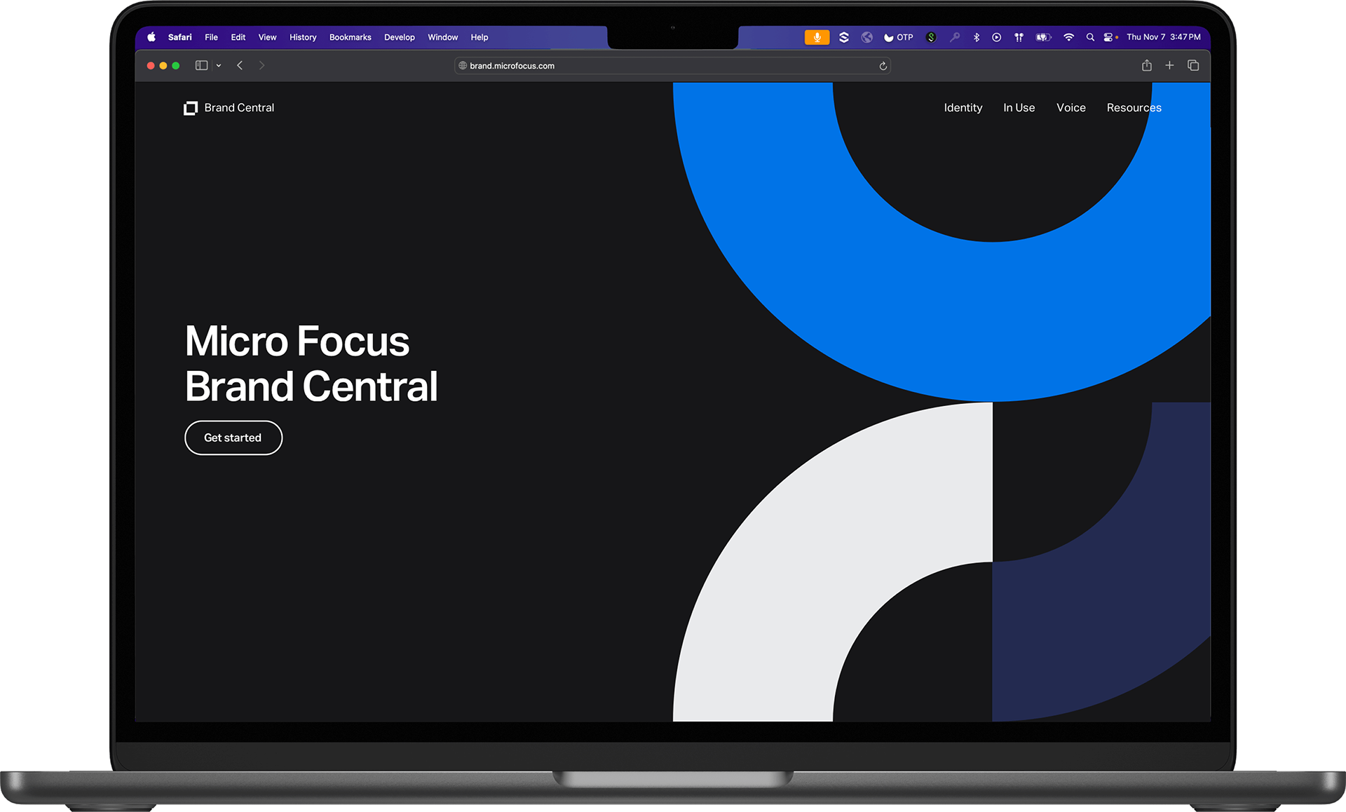
Splash page
I wanted to make the website hearken to a classic PDF document or physical book approach while taking advantage of the digital benefits. I designed the website with a “cover” of sorts—a splash page to welcome visitors when they first arrive. This allowed me to make a bold statement using brand visuals sized for impact. The splash page featured large geometric shapes—part of the Micro Focus visual language—and a button to enter the site. This made for a striking introduction to the Micro Focus brand identity before getting into the nitty gritty.


Navigation
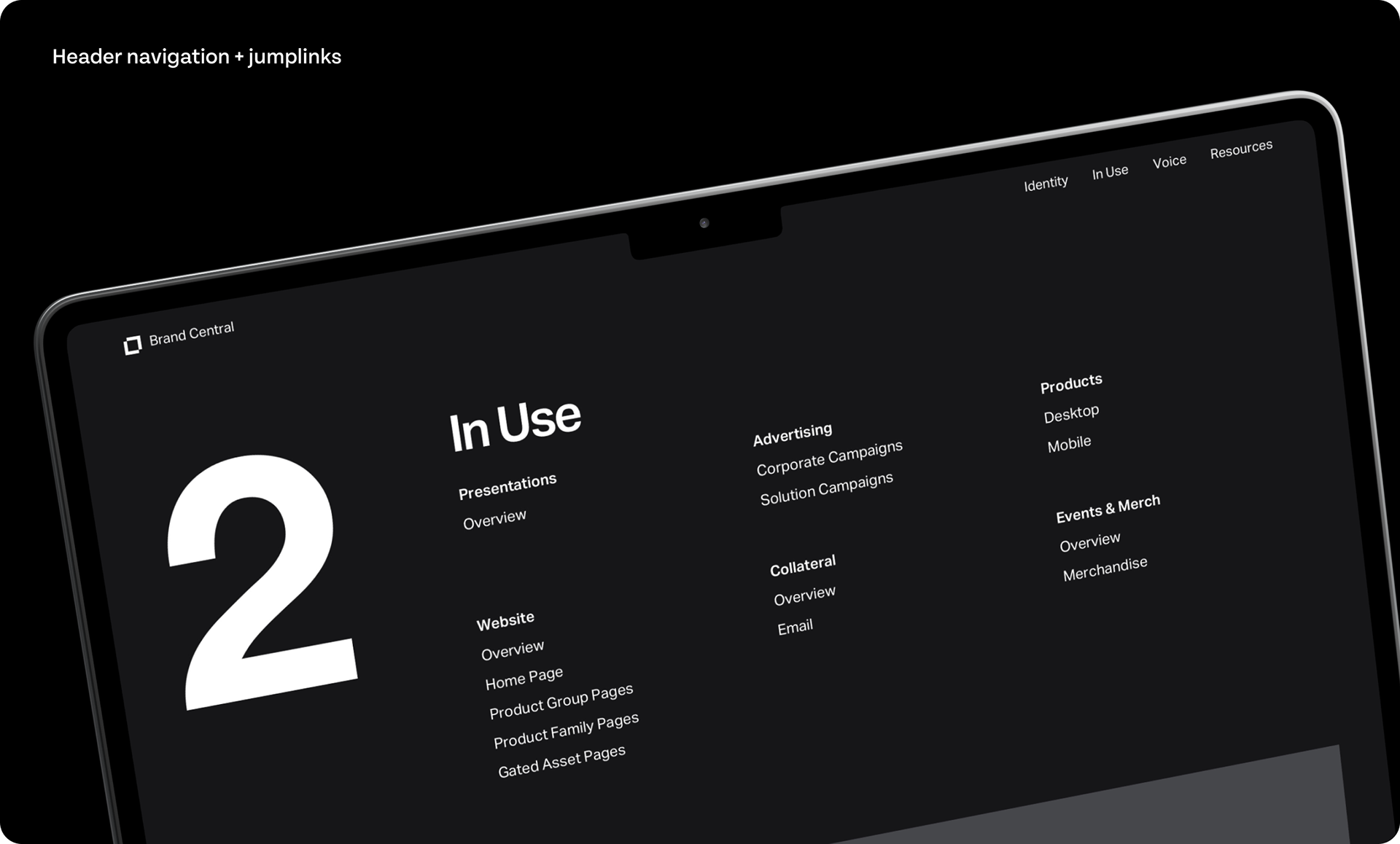
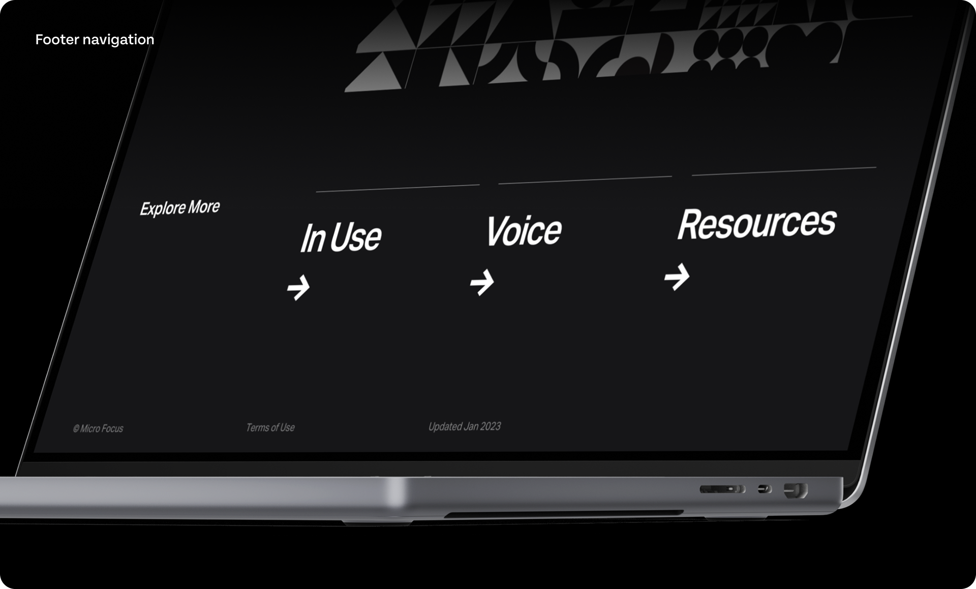
Each page on Brand Central featured three sources of navigation: the header navigation, the jump links at the start of each page, and footer navigation at the bottom. The header and footer navigation allowed for easy access to the four main pages of the site. The page jump links allowed for quickly navigating to the desired section within a page. These three navigation tools made it really easy for users to find the information they were looking for.


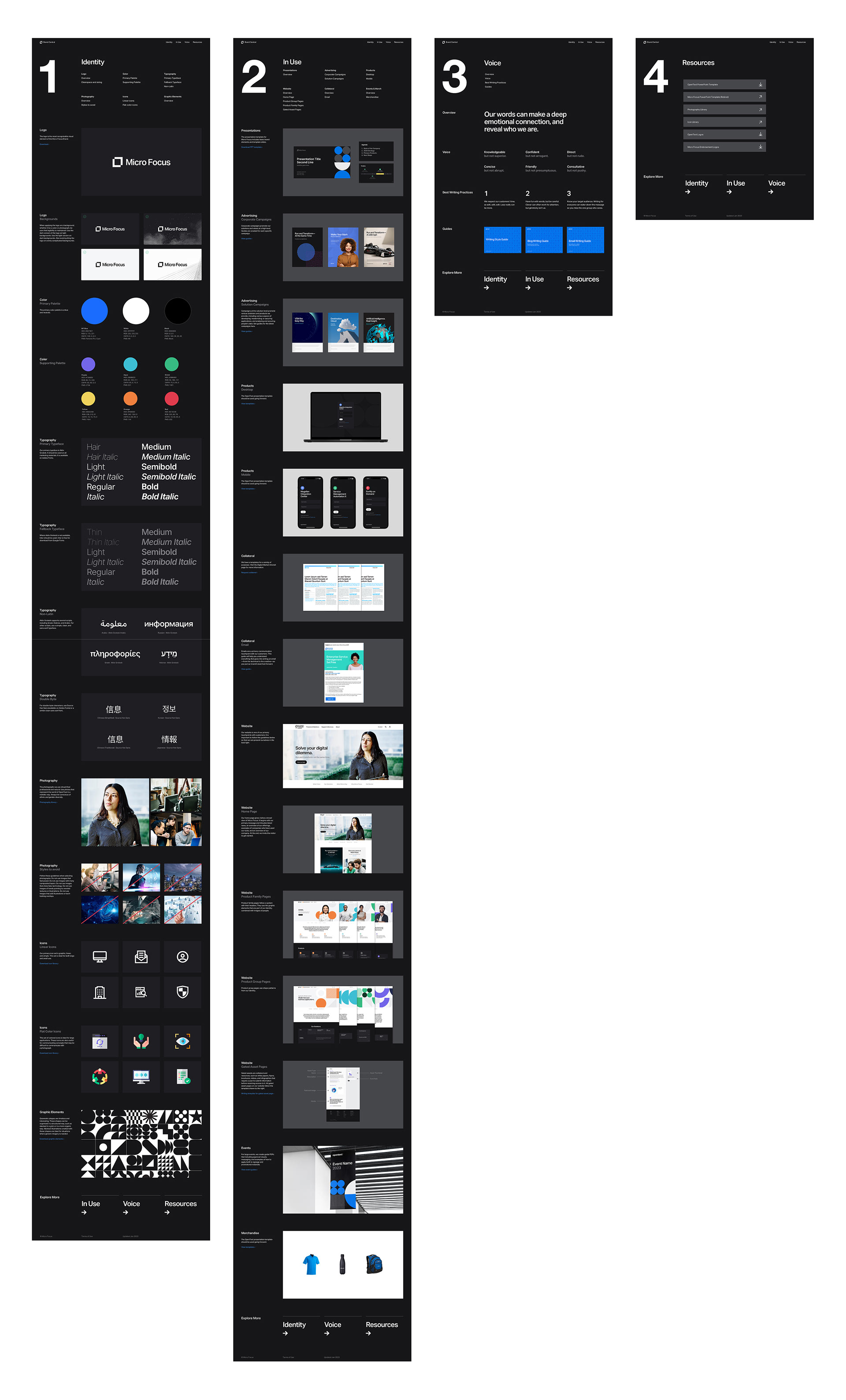
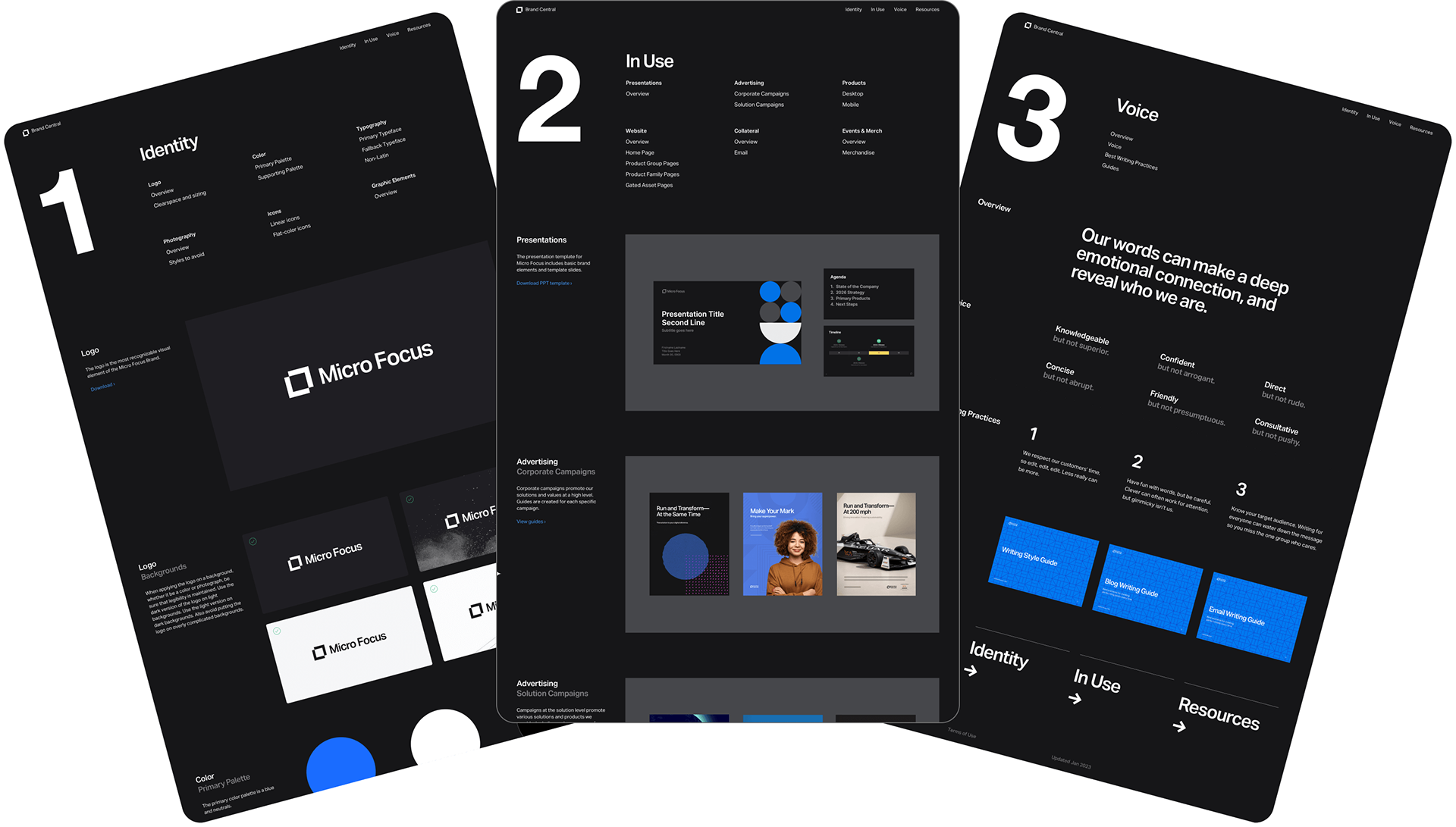
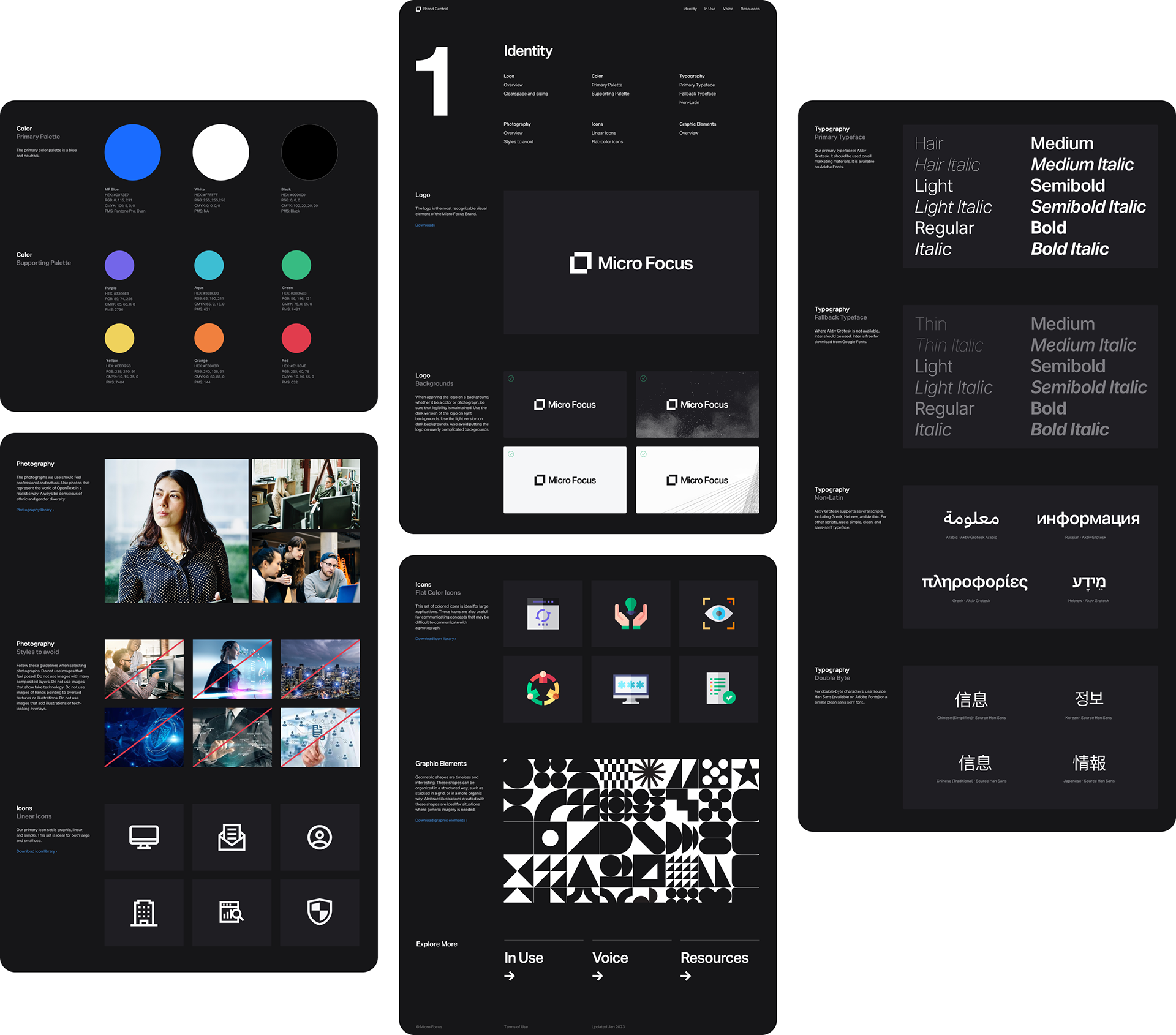
Identity page
The identity page featured the basic elements of the Micro Focus brand. This included the logo, as well as specifications for the colors, and provided essential guidance about and examples of appropriate photography. It rounded out the brand with a consistent visual language used for illustration, icons, and abstract textures and patterns.


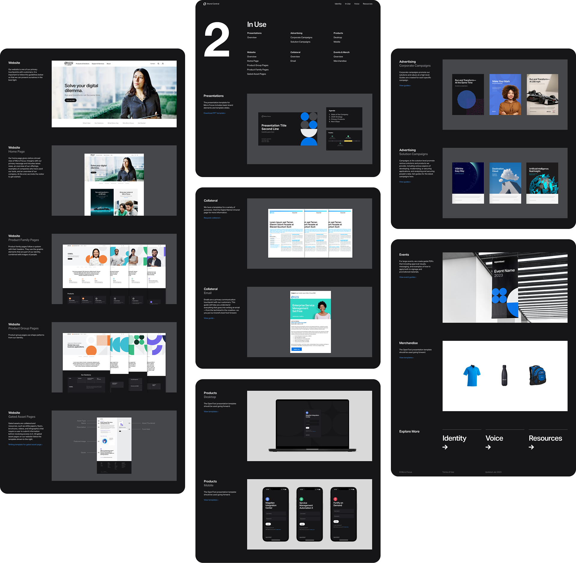
In Use page
While giving directions and providing basic brand elements is essential, it’s not enough. I designed a page to show the brand identity in action—how it would look when applied to the corporate PowerPoint, the website, and to merchandise. This page allowed employees to gain a vision for how all the pieces could be used to create consistent look and feel.


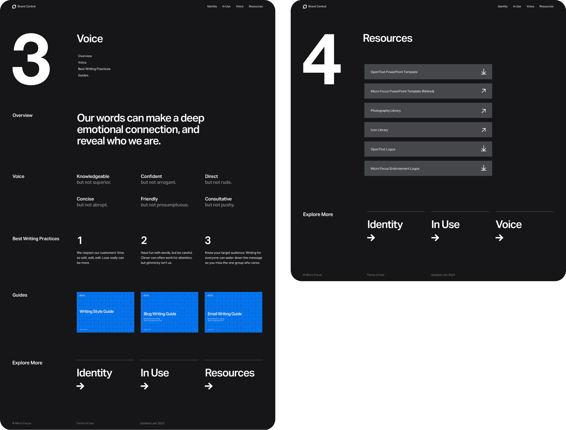
Voice and Resources pages
Just as essential to a brand identity as its visual component is its tone of voice and approach to messaging. We dedicated an entire page to provide writing tools and guidelines. In addition, one of the most beneficial aspects of having a website for brand guidelines is the ability to include direct downloads and links to assets. For ease of use, commonly used assets such as the logo and corporate PowerPoint template were made available on a page of resources.

Summary
These five pages made up the Micro Focus Brand Central website. Shown below is the site architecture and full screenshots of the pages.